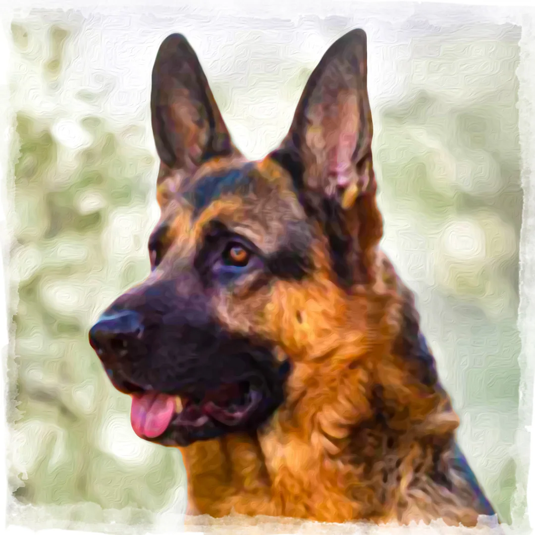
Experience navigator
Explore the archive by colour, mood and energy
Every artwork on iZoot.com is digital — painted, composited and finished on screen. This explorer indexes the archive by the qualities you actually respond to: the palette that leads the picture, the mood it holds, and the energy it moves at. All images shown are preview-resolution; prints and products are produced from the original high-resolution artwork.
Colour
Explore by Colour
Palettes are grouped by the colour families that dominate each piece.
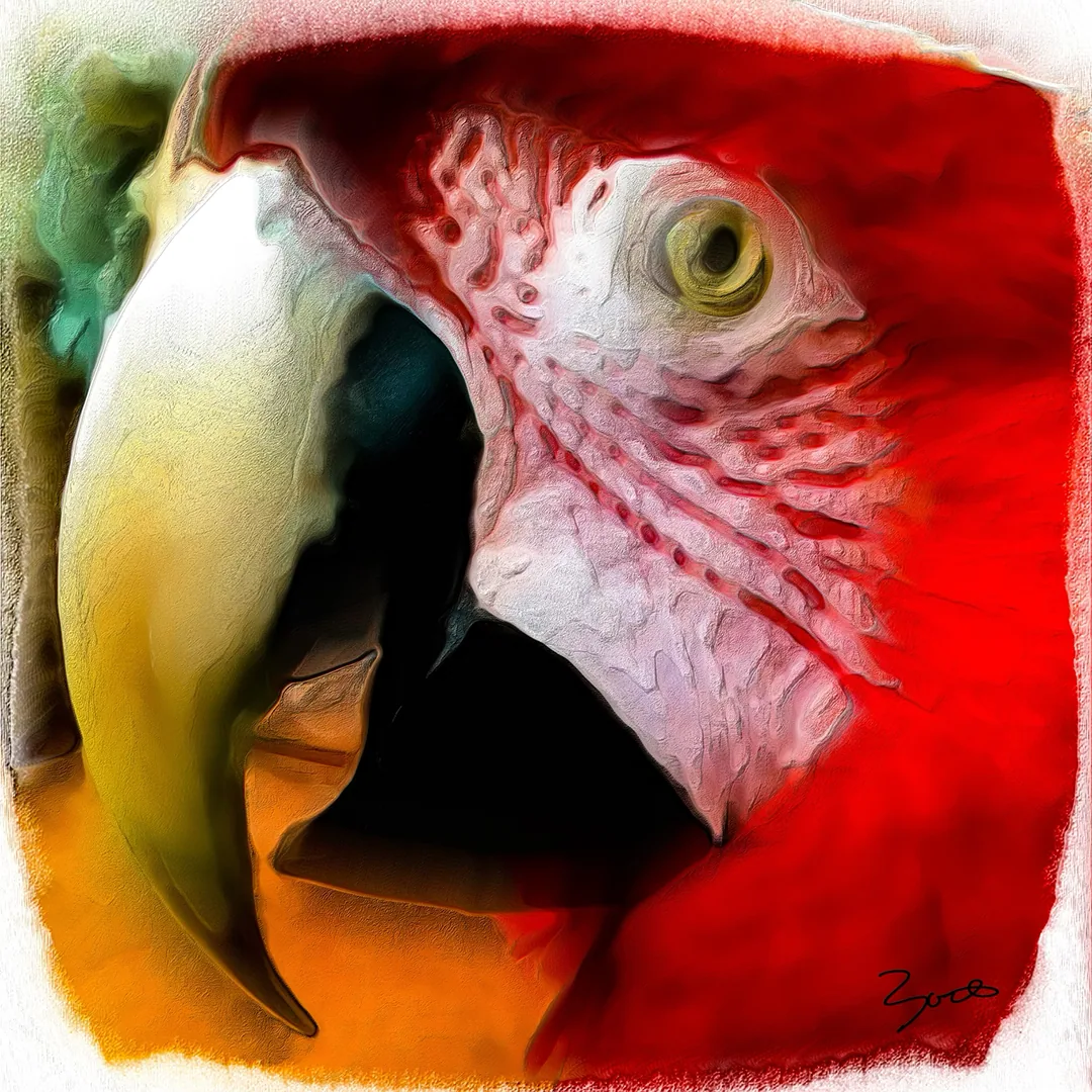 Vibrant84 worksSaturated colour at full strength — reds, magentas and electric blues held together.Shown: Elvis, 2025
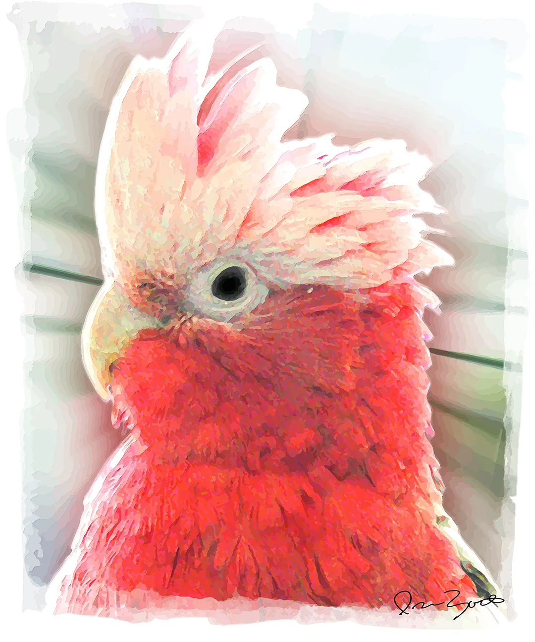 Warm64 worksReds, oranges, golds and ambers: work that carries heat.Shown: Rosie, 2025
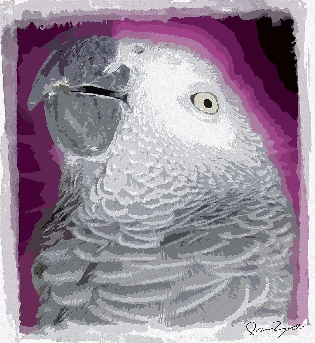 Cool74 worksBlues, teals and violets — the quieter, deeper end of the spectrum.Shown: Reggie, 2025
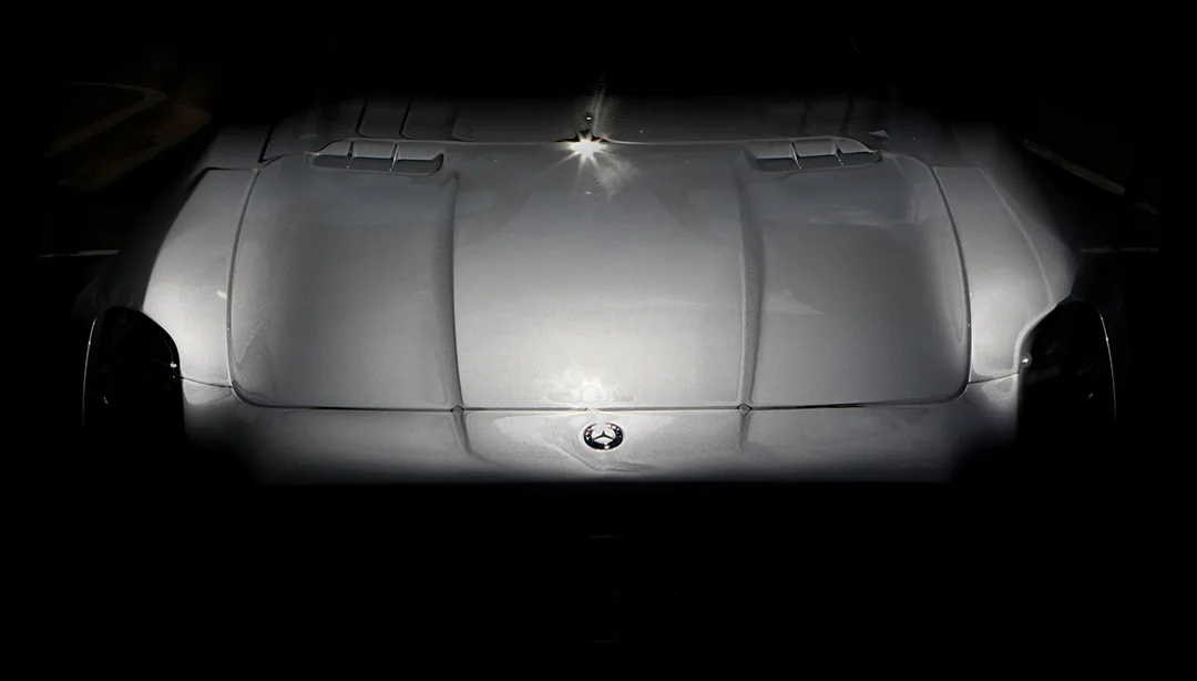 Monochrome25 worksBlack, white and grey. Tone, contrast and light without colour.Shown: Mercedes SLS, Hood, 2024
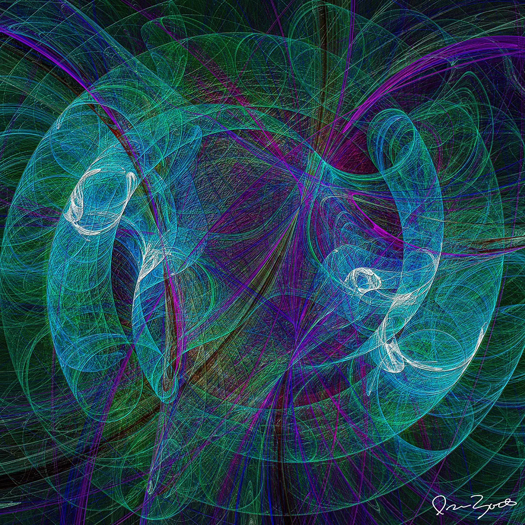 Neon18 worksLuminous cyan, lime and magenta that appear to emit rather than reflect.Shown: Munklo V, 2025
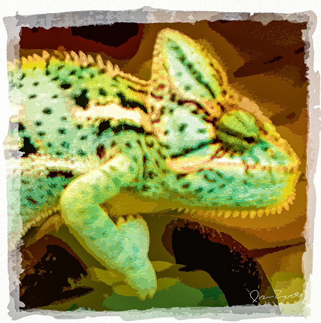 Earth tones2 worksBrowns, ochres, sand and moss — pigment colours drawn from ground and stone.Shown: Veiled Chameleon, 2025
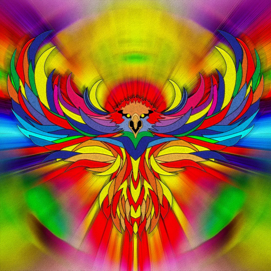 Multicolour70 worksFull-spectrum pieces where no single colour family leads.Shown: Eagle VIII, 2025
Mood
Explore by Mood
Mood groupings describe how a picture feels rather than what it depicts.
- Dreamlike77 worksSoft edges and drifting form — images that behave like half-remembered scenes.Shown: Reggie, 2025
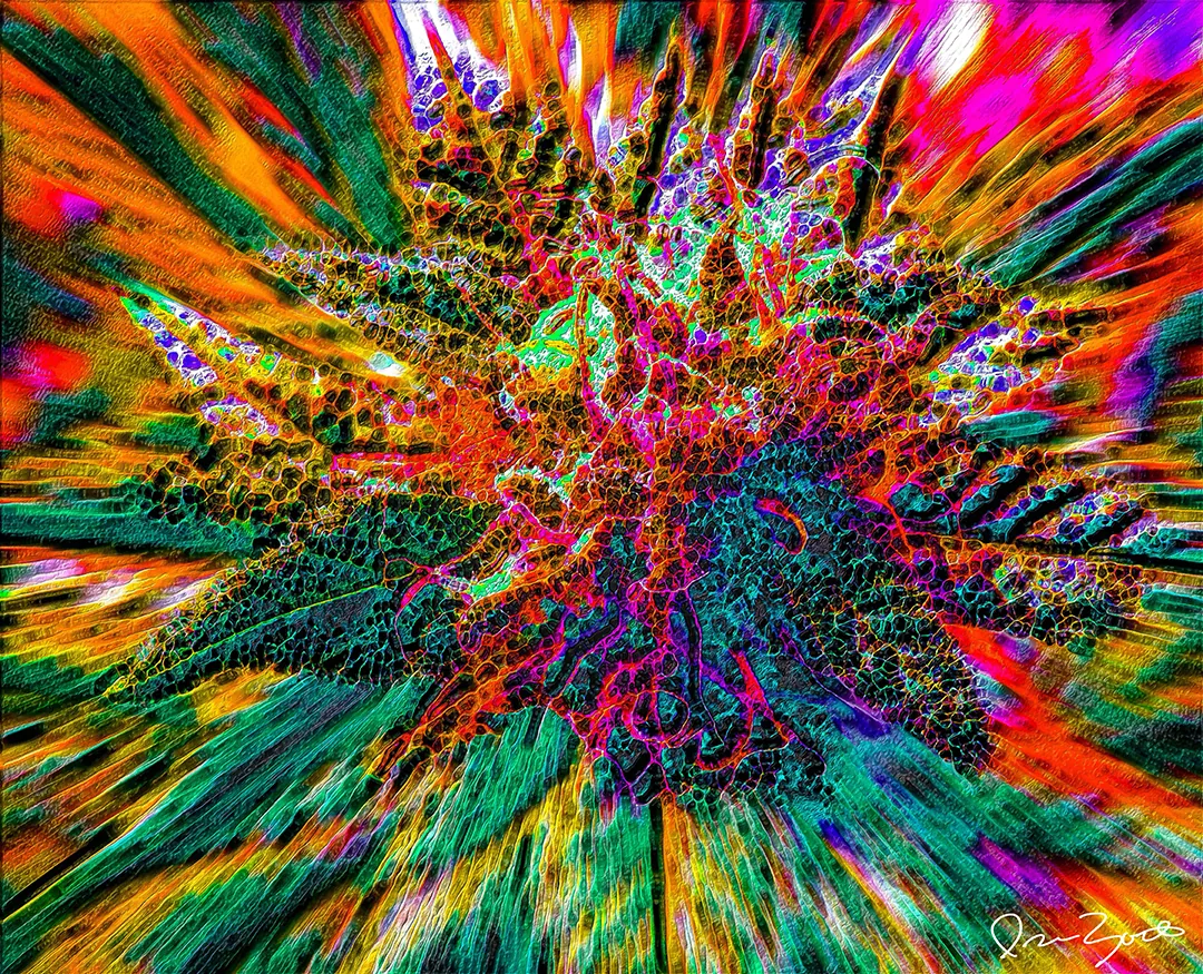 Energetic109 worksFast marks, high contrast, forward motion.Shown: Budaza XXX, 2025
- Peaceful15 worksEven light, settled composition, room to breathe.Shown: Rosie, 2025
- Mysterious25 worksDarker fields where colour survives only in the seams.Shown: Mercedes SLS, Hood, 2024
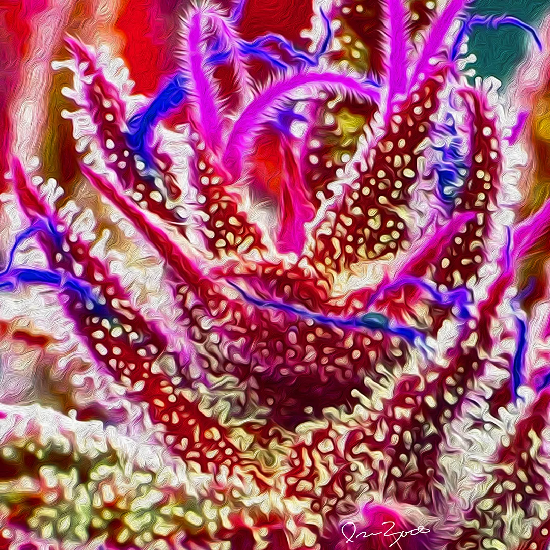 Playful38 worksBright, graphic and unguarded — including the wearable and product work.Shown: Budrasten I, 2025
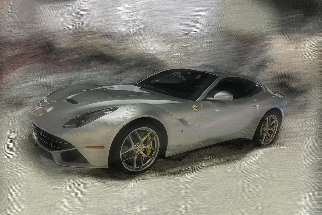 Intense39 worksDense, loaded surfaces that press against the frame.Shown: Berlinetta, Silver, 2025
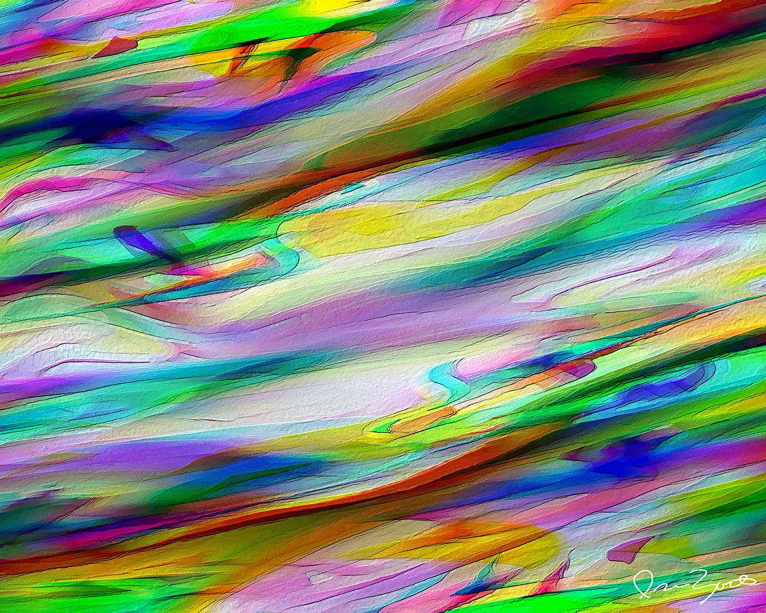 Surreal19 worksRecognisable things put somewhere they could not be.Shown: One Q XXXII, 2025
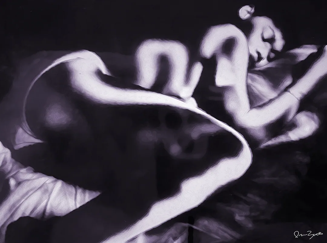 Contemplative11 worksPhotographic stillness and observed, unarranged detail.Shown: Bod IV, 2025
Energy
Explore by Energy
Energy describes the pace of the work — from held-still to deliberately chaotic.
- Calm37 worksHeld still. Nothing hurries the eye.Shown: Reggie, 2025
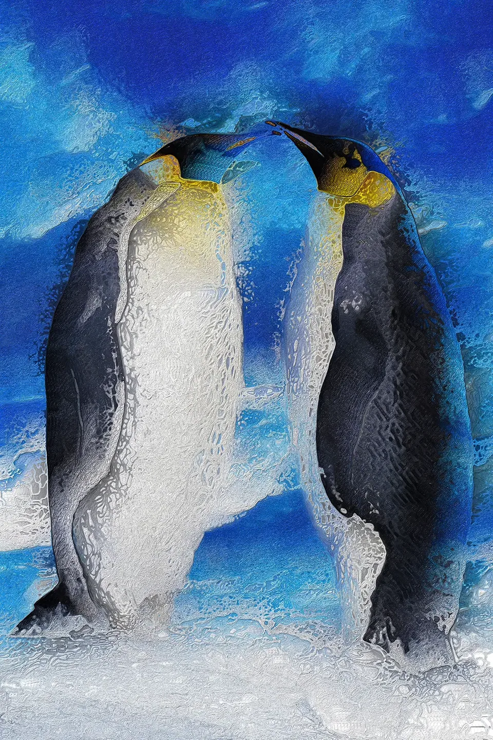 Flowing84 worksContinuous movement — ribbons, curtains and drifting colour.Shown: Penguin IV, 2025
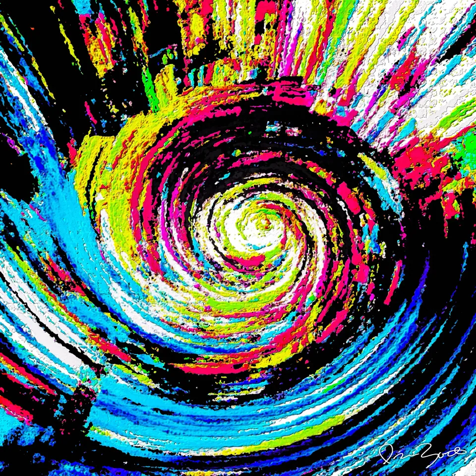 Kinetic9 worksRotation and thrust: the gesture caught mid-turn.Shown: Vortex XII (Variation GP), 2024
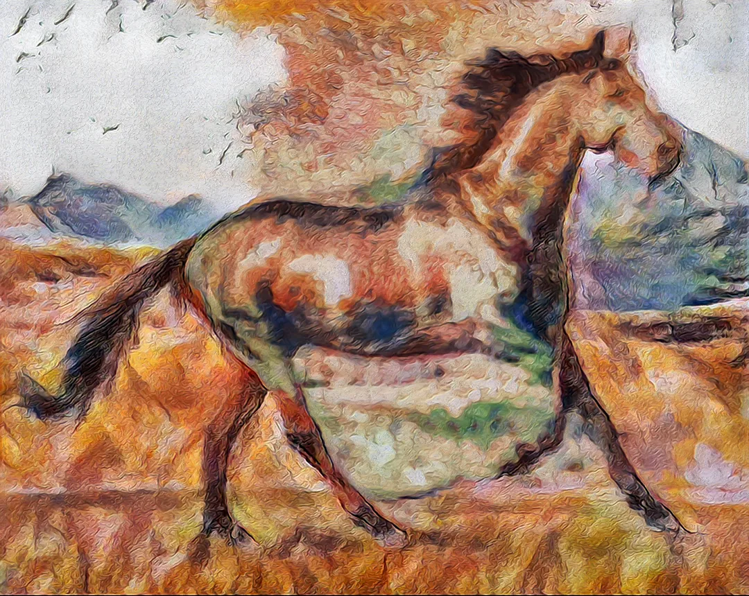 Bold84 worksBig shapes, hard decisions, high colour.Shown: Horsey I FX, 2025
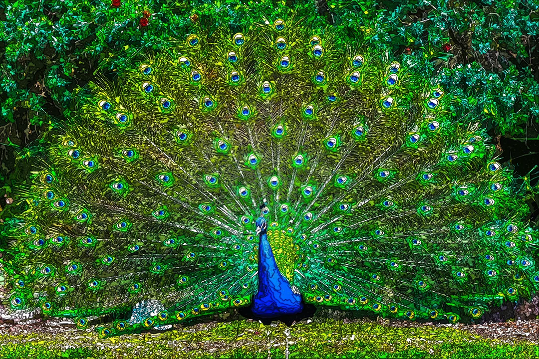 Meditative16 worksRepetition and pattern that reward a long look.Shown: Peacock IX, 2025
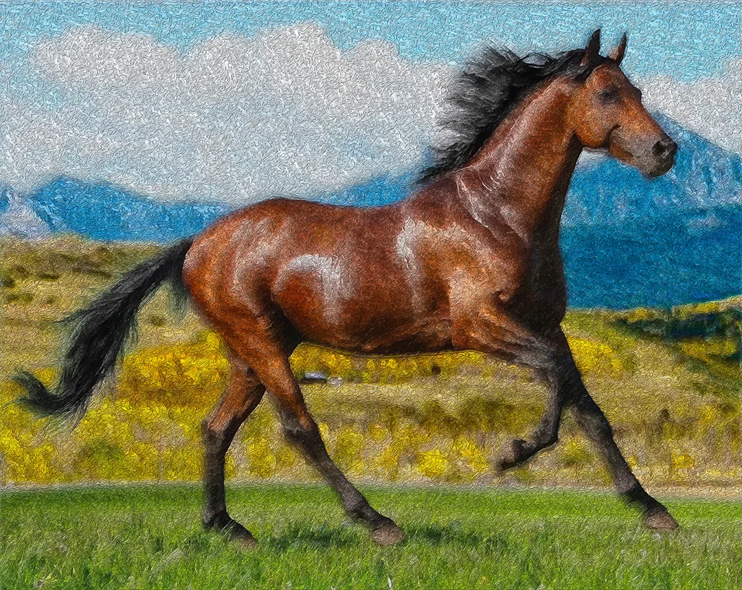 Chaotic70 worksCompeting directions, broken fields, deliberate disorder.Shown: Horse X II P, 2025
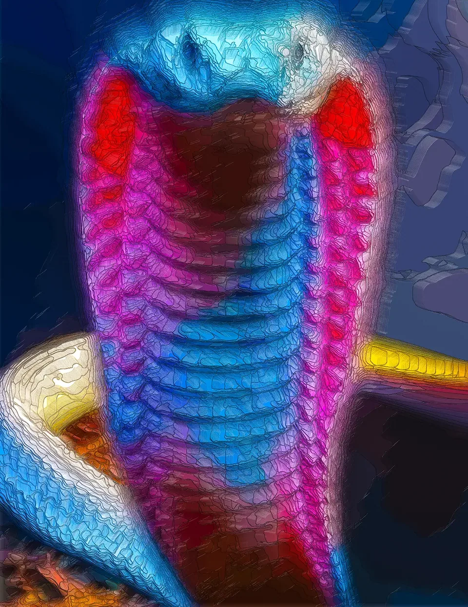 Luminous18 worksWork that reads as lit from inside.Shown: Cobra ZZ III, 2025
Colour
Earth tones artwork
Browns, ochres, sand and moss — pigment colours drawn from ground and stone.